
Jayna Wu
Geena Yin
Sunny Park
Kelly Liu
User Research
Contextual Inquiry
User Personas
Journey Maps
Figma

Lululemon is an athletic apparel company for yoga, running, training, and most other means of exercise. Their mission is to promote well-being in every aspect of people's lives – physically, mentally, and socially.
Since the pandemic, the landscape of Lululemon stores has evolved quite a bit. As a result, educators (store employees) have continued to adapt to the changing landscape. Along with shifts in responsibilities, this has caused educators to rely on some technology more and some technology less.
Because of this, Lululemon's UX research team challenged our team at Berkeley Innovation, a human-centered design consultancy at UC Berkeley, to understand their employees' responsibilities and day-in-the-life in regards to the technology they use, analyzing what is working well and where there are opportunities for an improved experience for them in serving guests.
How might we better understand all the educators' roles and activities and what tools/technology they use?
In this project, I led our team through research. One challenge we encountered was that we were not able to contact Equinox members for our research in the project. We tried asking the client if we could use non-Equinox gym-goers for our research, but they stated that Equinox members are vastly different from the average gym-goer. So, we looked into the surveys and interviews that the Equinox product design team conducted previously.
We also began Secondary Research with the aim of understanding who exactly our users are and what metrics they value the most in their workouts. Then, we performed Market Research to learn about how other similar apps motivate their users and which tracking features are the most effective/successful within these apps.

To converge and make sense of all of the data from our research, we created an affinity map, user journey maps, and user flows. Then, we narrowed down our "How might we..." question to narrow our scope.


Once we had clear insights from our research, we began our ideation process. After narrowing down our "How Might We..." question, we brainstormed, using methods like Crazy 8s and rapid ideation to see what features we wanted to change or implement.
We also determined that Archetypes B & C would be the most likely to use the new features in the Activity tab since they already book and monitor their group fitness and personal training sessions through the app. Thus, we decided to ideate with mostly their needs in mind; however, we also wanted to implement new features that would cater to Archetype A's needs, making the app more useful and appealing to all user groups.


We began to design distinctly for data visualization, motivational features, & celebratory designs.
Our biggest challenges were deciding which metrics to include, how they should be visualized, and what hierarchy they should have on the screen.
An important decision we made at this stage was to split up the data into day/week/month/views as users would be able to see both individual stats as well as how they compared over a period of time. Incorporating this feature meant that we had to consider how our data visualizations would scale, or if they should change in structure entirely.

However, an issue arose with the type of data that we could gather. Our client communicated that the app would have access to only “Equinox-specific metrics,” meaning data that came from the machines at the clubs, class sign ups, appointments and self-input information.
From this constraint, we began ideating how the Activity landing page’s layout could still celebrate member wins and reflect personal fitness journeys.


The biggest change we implemented was incorporating a day/week/month/year view, each with their own calendars and data visualizations.
When opening the tab, it’d still land on the month view just as it does now, so that users are easily accustomed to the update and can see data comparisons over a larger time period. If they want to choose a specific week or day, then they can easily move to each respective tabs and select the dates to look at their history.
We used pie charts, bar charts, and line graphs to display different types of data to appeal to Equinox’s differing member archetypes.
The pie charts show a break down of higher-level metrics for all logged activity types; the bar charts are for typical class numerical data such as calories and duration; the line graphs require self-input of weights and sets, targeting archetype A users more.


Implementing motivational notifications helps encourage users to keep going and help them achieve their fitness goals. We thought it would be beneficial to incorporate the notification in the page for the user to see it every time they check their activity; however, if they don't want the notification on their page, they can easily X it out.
One addition we explored to appeal to Archetype A - or, really anyone who works out with sets and reps - based on market research of other health apps, was including a method to log weights and exercises.
This would allow members to see a history of the types of training they’ve done, as well as track any increases in weight or strength.
As my second project with Berkeley Innovation, I was super excited, yet nervous to take on this challenging project with Equinox. Leading research in this project, I was able to utilize and develop my UX Research experience from my previous project with Lululemon. Most importantly, as my first real design project, I was able to develop my design capabilities, learning more about the ideation and prototyping processes.
One of the key lessons I learned from the Equinox project was the importance of empathy in the design process. Understanding the motivations, goals, and pain points of each type of user was critical in creating a user experience that resonated with them.
Huge thank you to the Equinox team and our client Molly Werner for their ongoing support and guidance throughout the project and beyond! I'm so grateful for the opportunity to collaborate with a team that helped me grow so much, both as a team member and a designer!

To begin our research, we decided that it would be important to learn about what employees want and what they value in their roles and work environment. This helped us begin to understand what questions would be useful to ask in surveys and interviews, ultimately guiding us to the next step in our research. Here are the findings from our preliminary research:

In this project, I was in charge of the synthesis process. I led my team through wrapping up interviews, narrowing down our "How might we..." question, and the process of affinity mapping & gathering insights.
We grouped our data into four main topics:
Then, we created subcategories and identified recurring patterns!

From our affinity map, we generated a list of educator needs and wants. Then, we arranged needs based on:
Finally, we identified High Priority and High Feasibility items to focus on in generating insights

One challenge we ran into was that when we made all the personas for each role, they all seemed quite similar due to their overlapping responsibilities. Thus, we decided to make one "main persona" that encapsulated all the similarities between each role. Then, we made "mini-personas" for each role to easily distinguish the differences between each role's painpoints, motivations, goals, etc.

Another issue we encountered was reflecting the accurate user journey for each role. The reason why this was so challenging was because no role has a linear journey, which is usually reflected by a line within journey maps. Thus, we had to think about how to portray their journey without making it seem linear.
Additionally, some roles complete tasks on a daily basis, while others complete tasks on a weekly basis. Thus, we reflected our journey maps accordingly, with some demonstrating the typical responsibilities in a week and others in a day.

We also included a technology chart, demonstrating a comprehensive look at our insights from each technology. For each technology, we included a section for functionality & usage, painpoints & frustrations, and our recommendations to communicate how we would change them in order to improve educators' experiences.

As my first project with UC Berkeley, this project taught me so much about the process of UX Research, helping me learn about the importance of empathy.
Through this experience, I discovered the impact of understanding and connecting with the perspectives and emotions of our users. Additionally, I learned about the importance of creating a nurturing environment where users can freely and authentically share their thoughts and feelings
On top of learning invaluable UX Research skills, I'm so grateful for my wonderful team, who became amazing friends throughout the process. I'd also like to thank our clients Michelle Sufka and Kayla Oliveira for giving us such thoughtful feedback, suggestions, and resources. Everyone involved truly made teamwork and collaboration so much fun and enjoyable, and I'll forever be thankful for this amazing experience as my first client project.


We decided that it would be insightful to interview advisors because they are the ones primarily helping students, talking to them each day and understanding what they commonly struggle with. We interviewed 7 advisors from different departments, and we came up with our questions using preliminary research.

We took all of the observations, suggestions, and notes that the advisors gave us and organized them to what we thought would best suit students. We organized them into separate categories for time of month per semester for 6 different years (freshman, sophomore, junior, senior, transfer junior, & transfer senior).
After organizing everything, we rewrote the information into messages that would be displayed on the Bear Bulletin card in CalCentral’s dashboard.

After creating our first iteration of messages for each year, we did our first round of usability testing with students. Our first round of usability testing included 8 students, while the second round of usability testing included 7 students. All 15 students were of varying years and majors.
After each round of usability testing, we reevaluated all of our messages and adjusted them according to the feedback we received. It was interesting hearing how each student had their own varying opinions of each message depending on their different needs and experiences.
We walked each student through each message throughout the semester, displaying it how they would see it in the card on CalCentral (based on the first iteration).
For each message, we asked them these questions:
*Note: we had separate sets of interview questions for each year since they all have different needs
We also asked a few other questions at the end regarding the placement of the card on the dashboard and other general questions.

After receiving all of the feedback from our student usability testing interviews, we used a software called Dovetail, which was really helpful with synthesizing all of the information. We uploaded all of the recorded interviews into the software and it provided us with the transcript. Then, we went through each transcript and tagged different feedback or other notes from each student and organized it into this affinity map:

As you can see, we received lots of feedback!
Since the design system of CalCentral is already established, we didn’t have much authority over the design of the card. However, we had complete autonomy over the message itself, which was the most important part.
Even though we didn't have a lot of design autonomy, we did make a content style guide for each messaging card to keep them standardized. We also decided to make the top of the card blue to make it stand out amongst the other grey cards on the dashboard.

One challenge of creating & finalizing the messages were keeping them concise. With all of the vast information, advice from the advisors, and feedback from the students, it was difficult to condense each message into a maximum of 2 sentences.
Another challenge was deciding when to display a message and when/if it should be repeated. We had several messages that were relevant for multiple points of the semester, but we didn't want to overwhelm students and show them too much information at once. We also had to take into account that students check CalCentral at different rates based on different points in the semester.
A third challenge was prioritizing certain information over others. Once again, we wanted to avoid overwhelming the student. We also wanted to have a good balance of displaying messages about academic help versus career advisory messages. Thus, for first and second-year students, we aimed the messages more towards academics, and for third and fourth-year students, we made the messages more future-focused.

We decided to move the Bear Bulletin card under tasks, contrasting the first iteration. Some of our student feedback indicated that students were worried about not being able to see their tasks if Bear Bulletin was on the top. Thus, we agreed that student tasks (such as paying fees and filling out necessary forms) were more of a priority for the students and switched around the card placements.

This project was very rewarding! I loved contributing to tackling issues that students, including myself, face. I also loved how with each user testing interview, I was able to talk to each student face-to-face and get their feedback. For each message, students expressed that the message & resources would be very helpful, and I’m excited to see it implemented on my student dashboard soon!
To begin my preliminary research, I conducted a lit review based on past SPO research done by the Zocdoc Research Team. I aimed to understand user goals/behaviors on SPO and identify what would be helpful to explore in the next round of user research to fill in our gaps of understanding.
Before starting my research, I led a UXR kickoff with stakeholders to align on research objectives, share out hypotheses, and learn about everyone's different perspectives. From there, I created my research goals:
The main goal of SPO is for providers to fill bookings.
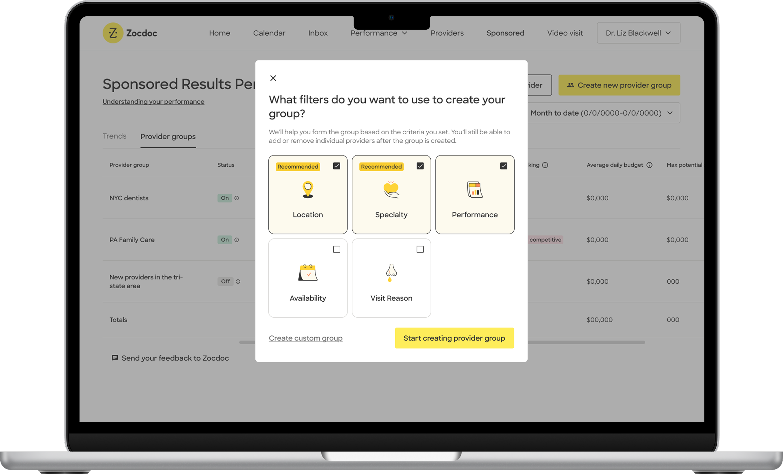
Based on the lit review, I came up with recommendations in the group creation flow to make filters that work towards this goal of filling bookings. These ideas (& more) became incorporated into new versions of the provider group creation flow to be tested in the next round of research. These ideas include:
To test these ideas & understand user preferences, we conducted user research on:
Attain a high-level view of what drives practices to create/modify groups to understand how they evaluate success, which filters they need, etc.
Test two concepts: a guided flow and a filtered flow. We want to see their preferences, comparisons to the current experience, and any challenges they encounter.
We interviewed 5 Zocdoc SPO users from local practices.
They had mix of insurance mapping (provider x location, practice, state, county).
All but one user had previous experience creating/modifying provider groups.
1:1 interviews, 60 minutes each
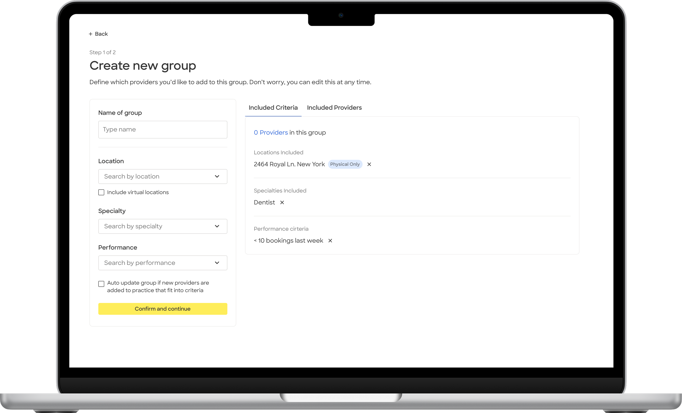
During the concept testing portion of user interviews, we gave users a common goal to see how they interacted with each prototype differently to accomplish the same thing.
Goal: Create a provider group for underperforming dentists in New York within your practice.
For each interview, we alternated which concept we tested first to minimize bias.
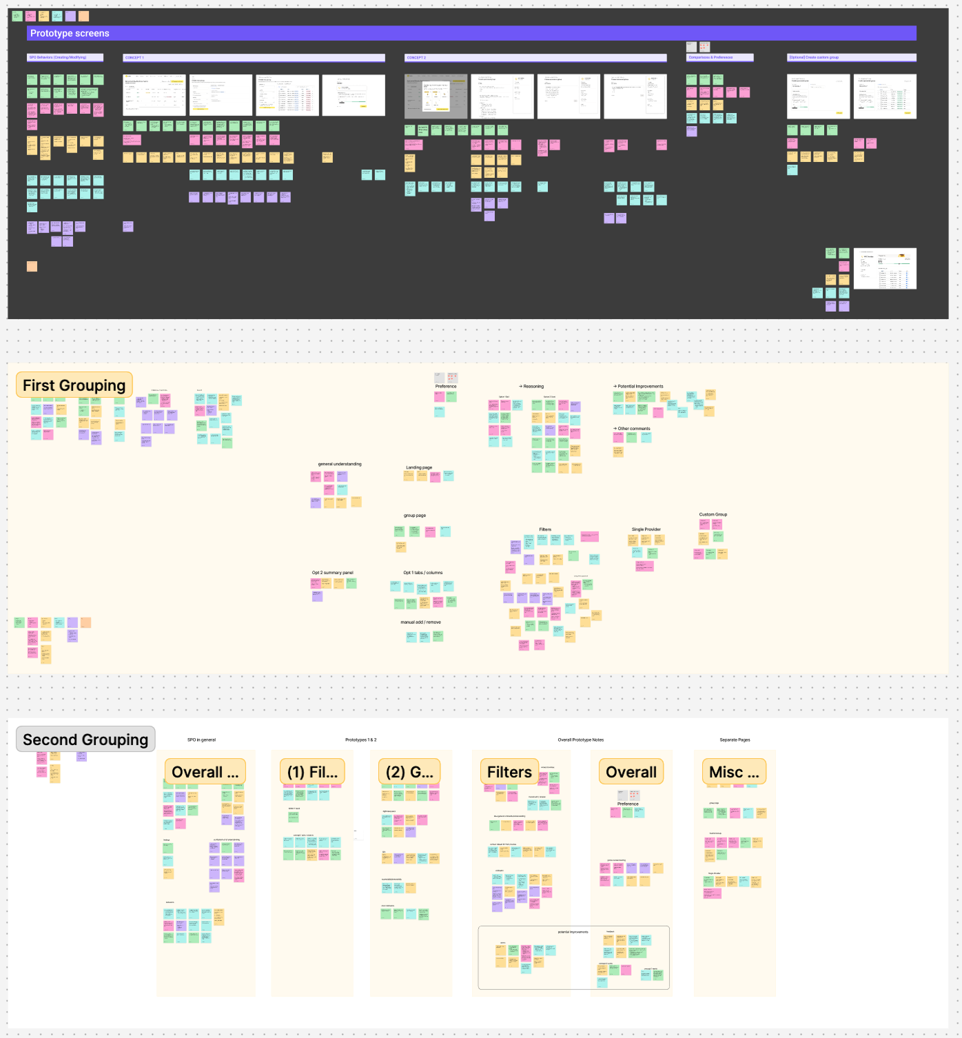
While conducting interviews, I took notes in Figjam.
Then, after the interviews were complete, I reorganized the notes into an affinity map to identify recurring patterns and potential recommendations.
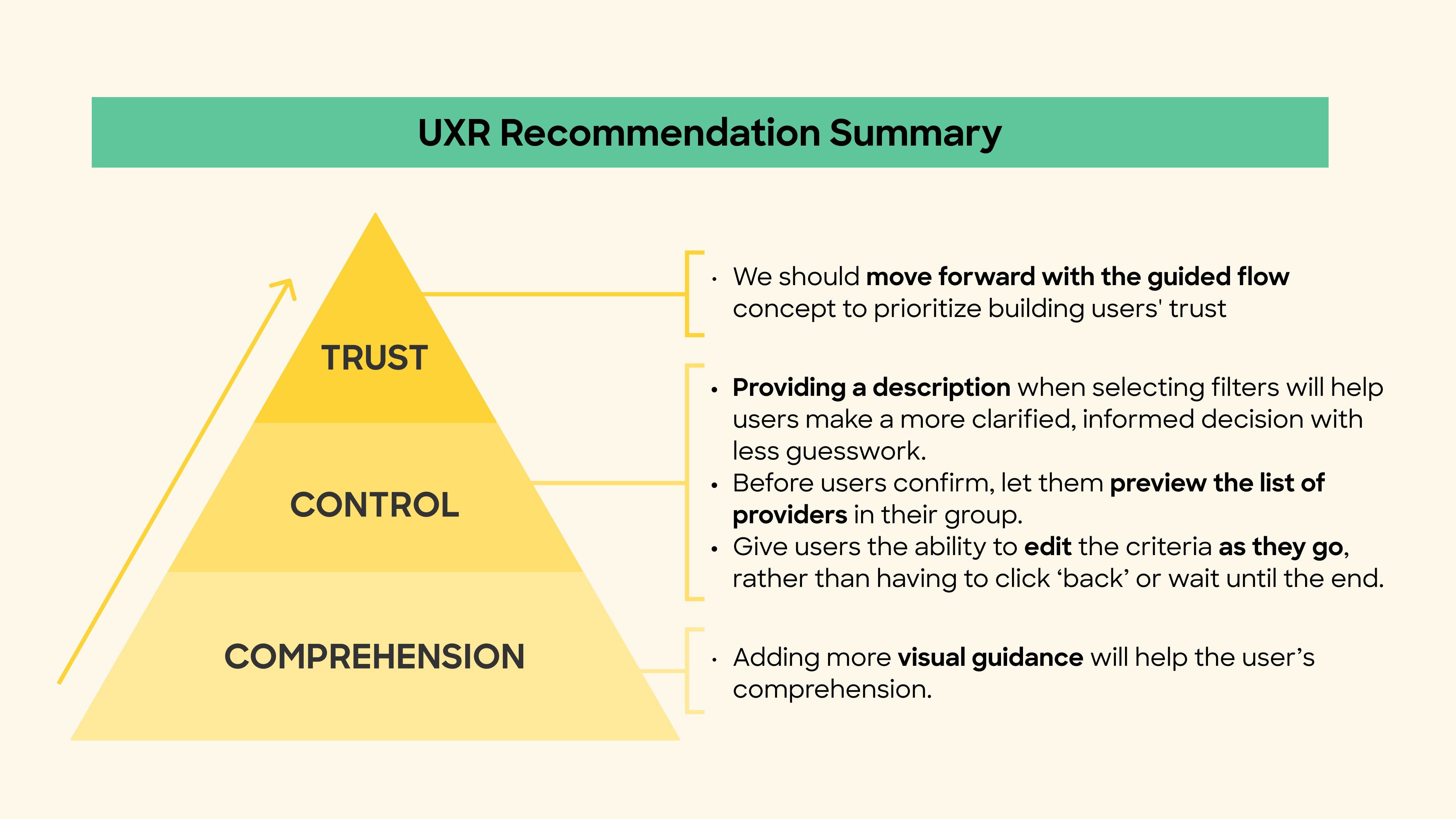
In order for them to have the ability to trust it, they need to feel like they are in control over what they're doing.
In order for them to feel control, they need to have comprehension to understand how to be in control.
How can they trust the product if they're confused about what's going on?
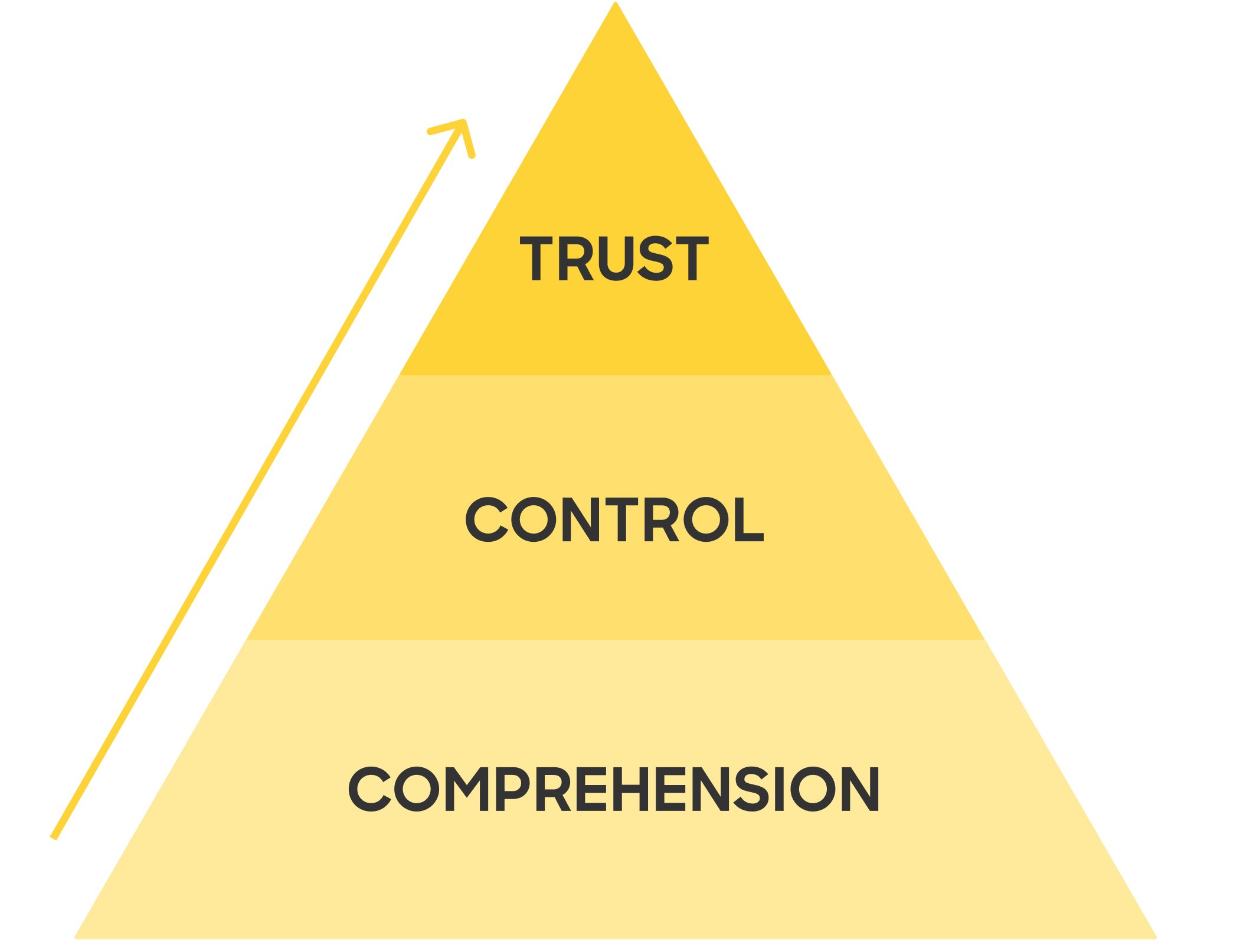
Users TRUST the guided flow more because it gives them more comprehension with how they think and empowers them to take control to confidently create groups.
While the guided flow provides comprehension, we still need to empower users to take control.
Filters build trust by giving users control.
Based on these findings, I came up with the following recommendations to be incorporated into the guided flow design:
I had the most amazing experience working on the UX Research team at Zocdoc over the summer in New York. Through this experience, I learned so much about communication & storytelling, cross-functional collaboration, strategies for interview moderation, the impact of a lit review, and delivering research that has a real impact on design.
Huge thank you to the UXR team, especially my mentor, Ben Familiant, who gave me so much invaluable feedback & direction, ultimately helping me learn and grow so much as a UX Researcher. Another big thanks to Ren Zheng, a product design intern with whom I worked very closely with on this project. I am extremely grateful for this opportunity to intern at Zocdoc, and it'll definitely be a summer I never forget!


In this project, I led our team through research. One challenge we encountered was that we were not able to contact Equinox members for our research in the project. We tried asking the client if we could use non-Equinox gym-goers for our research, but they stated that Equinox members are vastly different from the average gym-goer. So, we looked into the surveys and interviews that the Equinox product design team conducted previously.
We also began Secondary Research with the aim of understanding who exactly our users are and what metrics they value the most in their workouts. Then, we performed Market Research to learn about how other similar apps motivate their users and which tracking features are the most effective/successful within these apps.
To converge and make sense of all of the data from our research, we created an affinity map, user journey maps, and user flows. Then, we narrowed down our "How might we..." question to narrow our scope.
Once we had clear insights from our research, we began our ideation process. After narrowing down our "How Might We..." question, we brainstormed, using methods like Crazy 8s and rapid ideation to see what features we wanted to change or implement.
We also determined that Archetypes B & C would be the most likely to use the new features in the Activity tab since they already book and monitor their group fitness and personal training sessions through the app. Thus, we decided to ideate with mostly their needs in mind; however, we also wanted to implement new features that would cater to Archetype A's needs, making the app more useful and appealing to all user groups.
We began to design distinctly for data visualization, motivational features, & celebratory designs.
Our biggest challenges were deciding which metrics to include, how they should be visualized, and what hierarchy they should have on the screen.
An important decision we made at this stage was to split up the data into day/week/month/views as users would be able to see both individual stats as well as how they compared over a period of time. Incorporating this feature meant that we had to consider how our data visualizations would scale, or if they should change in structure entirely.
However, an issue arose with the type of data that we could gather. Our client communicated that the app would have access to only “Equinox-specific metrics,” meaning data that came from the machines at the clubs, class sign ups, appointments and self-input information.
From this constraint, we began ideating how the Activity landing page’s layout could still celebrate member wins and reflect personal fitness journeys.
The biggest change we implemented was incorporating a day/week/month/year view, each with their own calendars and data visualizations.
When opening the tab, it’d still land on the month view just as it does now, so that users are easily accustomed to the update and can see data comparisons over a larger time period. If they want to choose a specific week or day, then they can easily move to each respective tabs and select the dates to look at their history.
We used pie charts, bar charts, and line graphs to display different types of data to appeal to Equinox’s differing member archetypes.
The pie charts show a break down of higher-level metrics for all logged activity types; the bar charts are for typical class numerical data such as calories and duration; the line graphs require self-input of weights and sets, targeting archetype A users more.
Implementing motivational notifications helps encourage users to keep going and help them achieve their fitness goals. We thought it would be beneficial to incorporate the notification in the page for the user to see it every time they check their activity; however, if they don't want the notification on their page, they can easily X it out.
One addition we explored to appeal to Archetype A - or, really anyone who works out with sets and reps - based on market research of other health apps, was including a method to log weights and exercises.
This would allow members to see a history of the types of training they’ve done, as well as track any increases in weight or strength.
As my second project with Berkeley Innovation, I was super excited, yet nervous to take on this challenging project with Equinox. Leading research in this project, I was able to utilize and develop my UX Research experience from my previous project with Lululemon. Most importantly, as my first real design project, I was able to develop my design capabilities, learning more about the ideation and prototyping processes.
One of the key lessons I learned from the Equinox project was the importance of empathy in the design process. Understanding the motivations, goals, and pain points of each type of user was critical in creating a user experience that resonated with them.
Huge thank you to the Equinox team and our client Molly Werner for their ongoing support and guidance throughout the project and beyond! I'm so grateful for the opportunity to collaborate with a team that helped me grow so much, both as a team member and a designer!